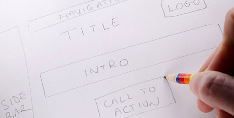
 So you’ve decided it’s time to design – or redesign – your website. Before you enthusiastically jump right in, here are six things you should consider before beginning the design.
6 Website Design Considerations:
1. Mission and Goals
What is the purpose of your site? Perhaps, before you can answer that, you need to ask: What is the purpose of your organization?
It may seem an obvious question, but check to see if there is an official mission statement, preferably brief. If it’s not brief, can you summarize it in just a couple sentences? Once you have that, go back to the website.
Keep your mission statement in mind, as it will guide everything else that you do and what direction you go with your website.
2. Audience
Now that you know what yourhoderay.com/blog/how-to-create-content-to-attract-customers site is for, next you must ask who it is for.
If your target audience is under 15, your design will be vastly different than if your target audience is over 60.
Know your audience. Know who they are, where they are, how they’ve come to your website and why they’ve done so. What will your audience find attractive or useful? What do they want from you?
Design that doesn’t keep these questions in mind, no matter how cool or cutting edge, fails. It’s like a spy’s watch packed with gadgets but unable to tell time.
3. Brand
Hopefully your brand is at least somewhat in line with your audience’s taste.
But even if this particular website is targeted at a small selection of your company’s wider audience, you still want your brand recognizable.
Maybe an academic publisher is launching a separate site to provide additional content to elementary schools using its textbooks. They’re designing for kids – but they also need to design to be recognizable.
What are your brand’s colors, fonts, symbols, phrases, and standards? How can you incorporate these elements into your design?
Don’t forget to include your logo from the beginning, and make it look good. A logo added as an afterthought has the potential to clash. A good site design will include the logo and branding smoothly.
Not sure how to go about designing a logo? Fill out our quick Logo Questionnaire!
4. Architecture
You know what your website is for, and you know who it is for. You know the look you want.
That’s all well and good, but just imagine trying to build a house just from a collection of pictures, with no blueprint!
Plan the layout of your site ahead of time, and incorporate this into the design. Write a sitemap; be familiar with your hosting options; and decide on a content management system. How easy will your website – and its new design – be to maintain?
Who will be able to add content, and how long will it take them? What can be changed, and where? Will the design break if the content changes? If your backend is a mess, the frontend may never be fully realized, and you may find yourself facing another redesign in a year or two.
5. SEO
Architecture tends to play into SEO when discussing navigation and URL structuring.
Besides navigation and URL's, another important SEO consideration is the on-page content you're using and what keywords you want to rank for. Before designing a website, you should do keyword research and structure your website in a way that will tailor pages to specific long-tail keywords.
If I want people to find me for "Web Design Services," a good way to structure a website would be to have a specific page highlighting that keyword and to represent the keyword in your URL.
6. Audience (Yes, Again!)
Okay, so I cheated a little when I said I had 6 things you should consider. But never, never, never forget your audience.
Whatever service or information your audience frequently needs must be obvious and easily accessible. Don’t make them dig for it, because most won’t.
Whatever functionality your website has, your audience shouldn’t have to figure out how it works. If a significant part of your audience is going to be on a slower connection, speed must be kept in mind with every element added.
If people will want to access your site from their phones or tablets – and these days, that’s generally true – your site will need to work on touch screen and smaller screens.
Be aware of what browsers and operating systems are most commonly used by your audience. Before you build, create a wireframe of your proposed design and do user testing.
Does it work? Do they love it? Okay, now you can enthusiastically jump right in.
Want to Strengthen Your Company Branding?
To further help businesses looking to run a successful branding strategy, we’ve created a complete 40 step branding checklist that will fulfill all your branding needs.
Tags: Web Design

